Data Viz at Cengage
Our team undertook an initiative to update our legacy educational products. These included animations, charts and data, motion graphics, and more. Many of these were built in Flash, or static design assets that needed to be updated when the data changed.
This visualization was used for a high-school-level political science course, as an exploration of income inequality in the US.
My role: Designer and developer, using React, Javascript and Chartist
View the Project
Technical Details
The Chartist library was selected because it outputs regular html rather than using the canvas element, which was not compatible with the Cengage platform. It was also scalable, as a subset of D3.js.
We built the proof-of-concepts in vanilla Javascript. Once those were approved, I transformed them into React components, some of the first components I built using React.
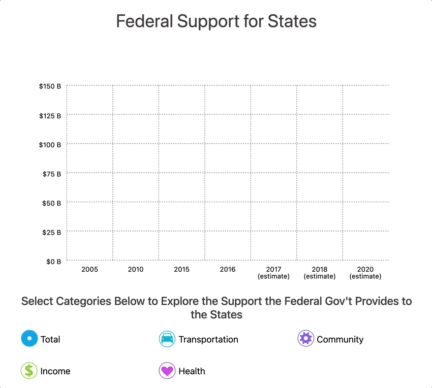
At right is another chart for political science, illustrating the concept of Federalism and the categories of support provided to states by the federal government.
Prologue
These projects represent the initial efforts to update the learning projects at Cengage, and a significant improvement to the workflow for future program development.
Rather than returning to the designers to update Illustrator files, new data could now be injected easily requiring few if any adjustments to the charts themselves.