Responsive design is here to stay. After a few years as developer-buzz, it has now reached critical mass, but some stakeholders have kept their heads in the sand, hoping it will go away.
“Responsive Web Design” is the process of designing, developing, and strategizing content for a website so that it is optimized for all devices. This approach eliminates the need for a separate “mobile” site, which would itself need to perform on the myriad devices out there today. So, if you’ve been running from the idea, it’s time to wake up and smell the coffee. You know who you are!
How Important is Responsive Design?
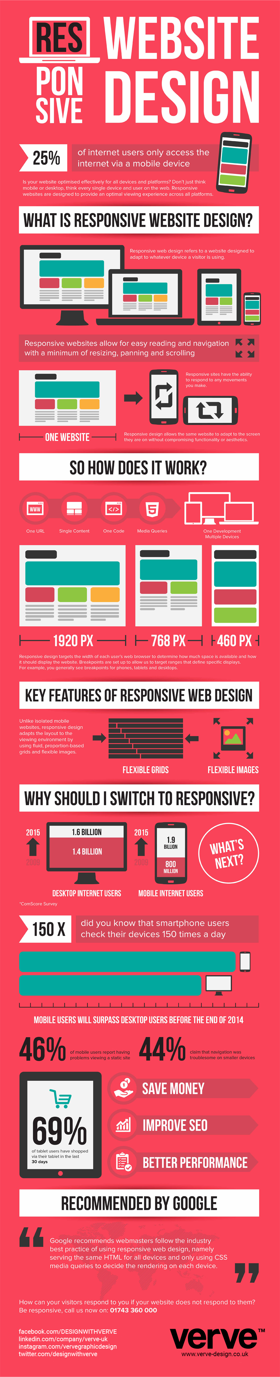
UPDATE: The numbers are staggering, and will only get more so. Check out this infographic from Verve to see stats and predictions as of September 2014.
Unless you want to lose a very large chunk of your audience, you need to go responsive. Now.
The Fundamentals
At it’s most basic, RWD (Responsive Web Design) involves setting up your site on a flexible grid system, usually using one of many available frameworks (e.g. Bootstrap, Foundation), where the “boxes” or areas of content, have percentage widths rather than fixed widths, and images are set to be no larger than 100% of the box they are in. We can contain and control our content by setting minimum and maximum widths. That’s RWD in a nutshell.
The complexity comes in when you consider that we are not just going smaller, but changing the orientation from landscape to portrait – turning the traditional desktop on its side and shrinking by 85%.
How to Approach Going Responsive
If you have a traditional website that is not responsive, rest assured that it will be viewable on smaller devices, just not optimized. But that warm feeling should end when you look at the stats in the preceding infographic that show how many people EXPECT a site to work well on their device of choice.
Technically speaking:
- It’s possible, as a stop-gap measure, to retrofit a site using a plugin
- You can always build a separate, responsive site and leave your existing site in tact (separate codebase)
- Build a new, responsive site from the ground up
This article on Smashing Magazine sums up the tactical options »
Unfortunately, the technical part is only the beginning. The important thing is to begin to THINK RESPONSIVELY – about your content, about your message, about how your users will use your website or application.